Primary & Chosen Design
Secondary Design
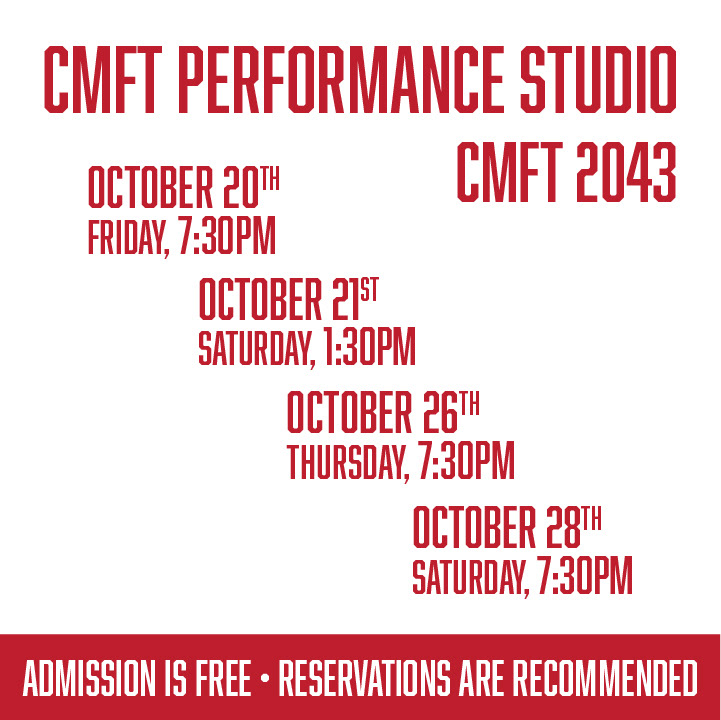
Social Media Promotional Ad #1
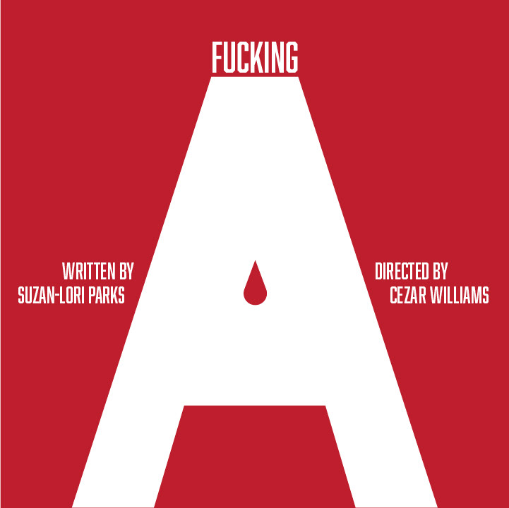
Social Media Promotional Ad #2
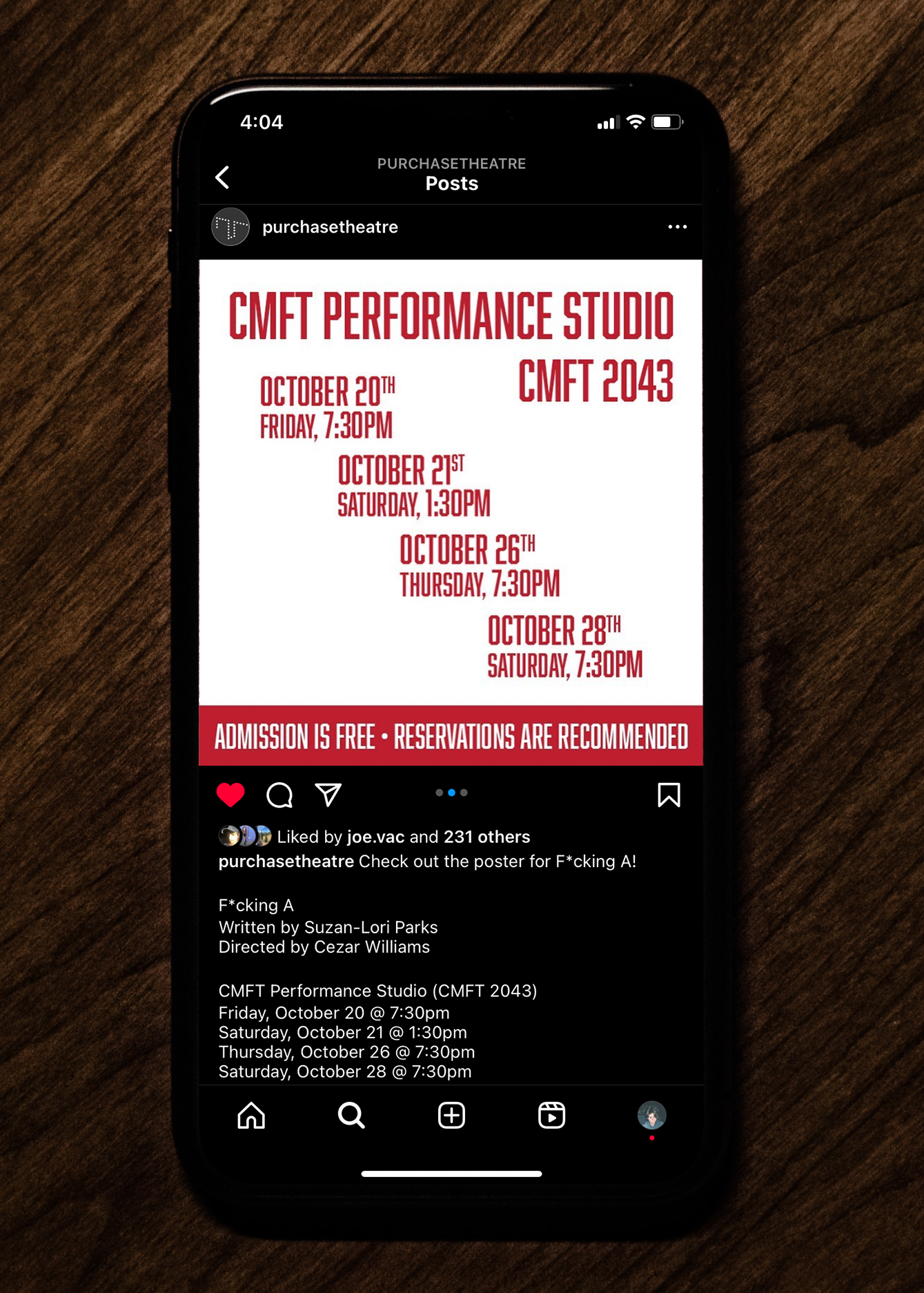
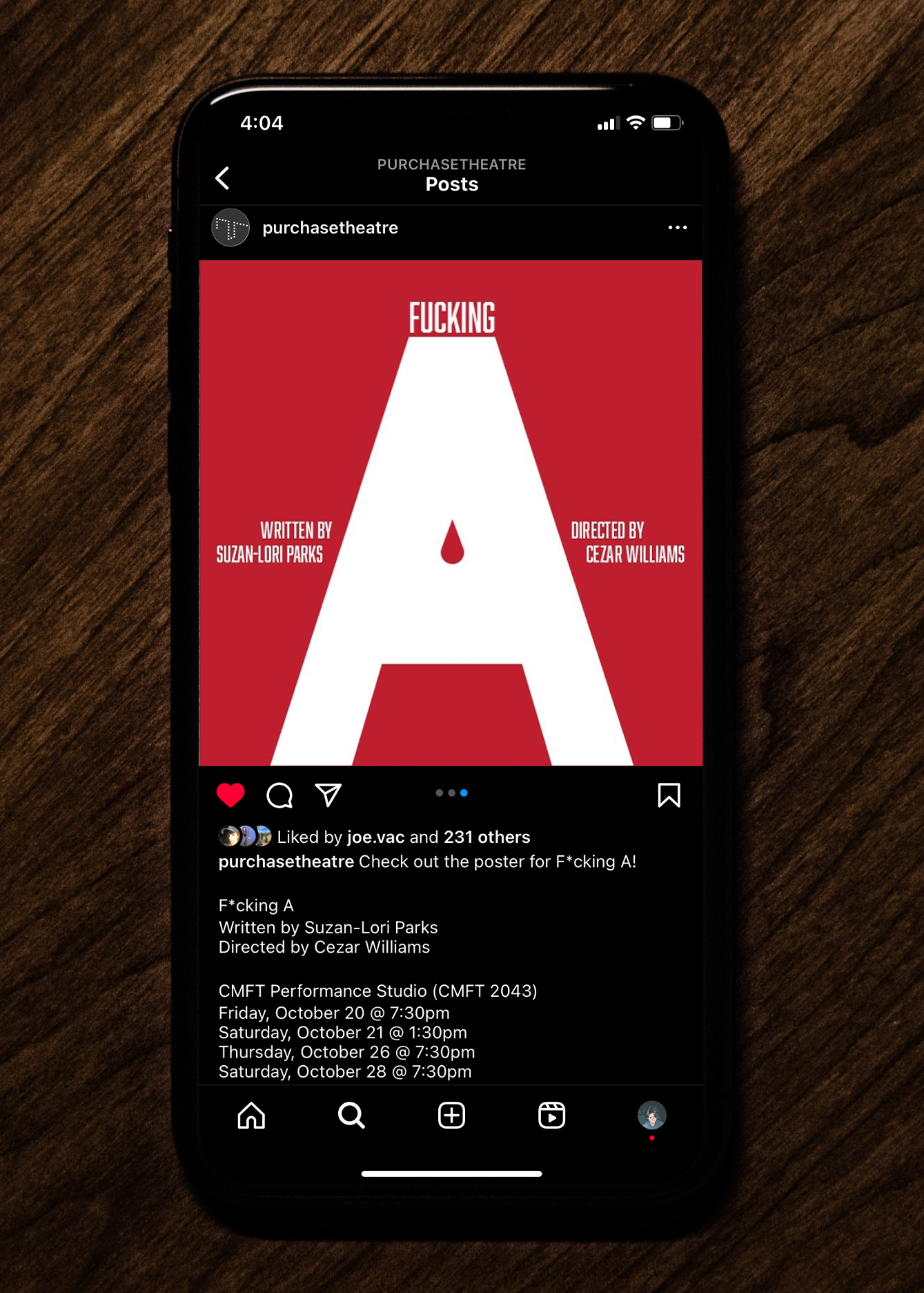
Social Media Promotional Animation
Design Adapted for Screens
As a designer working on a project for the theatre department, I was tasked with creating a poster for the upcoming play "F*cking A." It's important to note that the theme of the play was inherently gory. The challenge was to balance this intense theme with visually striking and modern design elements. Despite the graphic nature of the play, the chosen design successfully navigated the balance, contributing to the overall promotional efforts for the play. In tandem with my primary design for the "F*cking A" project, I concurrently developed a contrasting version that employed photography as the main imagery. The intention was to offer the client a diverse set of options, each catering to different visual preferences. While my initial design embraced a modern aesthetic with graphic elements, the alternative design took a different route by incorporating the power of photography to convey the essence of the play. Despite the contrasting approaches, the client ultimately opted for the more modern design, highlighting their preference for a specific visual direction. This process underscored my commitment to providing a range of creative options to clients, ensuring a thoughtful exploration of design possibilities before making a final decision. Beyond the poster, the project extended to include various deliverables such as social media ads for play promotion, designs adapted to different formats around campus screens, and even an animated promotional piece. The versatility of my design was evident as it became the central promotional material for "F*cking A," showcasing its effectiveness across diverse platforms. This experience was a rewarding opportunity to contribute creatively to a client project.
Primary & Chosen Design
Secondary Design


Social Media Promotional Animation
Design Adapted for Screens